I Tried Bluehost AI Builder: Here’s What I Created and How It Works
I tried Bluehost AI Builder by creating a fictional creative studio website. Here’s how it works, what I liked, and what to know before getting started.
Paid partnership with Bluehost
This article is sponsored by Bluehost. I earn a commission if you sign up through my affiliate link.
I’ve been using Bluehost to host The Girly System since I started the website in 2024, and it’s been part of my experience managing and growing my online presence. So when Bluehost introduced its new AI Builder, I was interested in seeing how it approached website creation.
AI website builders have become an interesting option for people who have an idea for a website but don’t necessarily have the technical skills or time to build one from scratch. But there’s a difference between describing a website and actually ending up with something you’d be happy to show someone.
I decided to put Bluehost AI Builder to the test by creating something completely different from The Girly System: a fictional creative studio called Atelier Form.
The idea was to build a polished portfolio website for a small design studio, complete with a homepage, project gallery, services section, and contact information. I wanted something that felt like a real creative business rather than a generic website template.
Here’s how the experience went, what I liked about the results, and a few things worth considering before trying it yourself.
What Is Bluehost AI Builder?
Bluehost AI Builder is an AI-powered website creation tool that lets you describe the website or web app you want in a sentence and then refine the result through conversation.
Instead of starting with a blank page and manually arranging every section, you begin by explaining your idea. The builder uses that description to generate a website that you can then adjust by chatting with the AI.
The interesting part is the conversational approach. You don’t have to get every detail right in your initial description. You can review what it creates, explain what you’d like changed and continue refining the design.
Bluehost AI Builder is $0 to start, no credit card. paid plans from $20/mo..
The free plan publishes your website on a Bluehost subdomain. If you want to connect your own domain, you’ll need a paid plan.
You can explore it here:
I earn a commission if you sign up through this link: Try Bluehost AI Builder.
My Website Idea: A Creative Studio Called Atelier Form
For this experiment, I wanted to create a website for a fictional independent design studio specializing in brand identity, book cover design, editorial design, packaging, and art direction.
I called it Atelier Form.
I had a fairly specific visual direction in mind. I wanted an editorial-inspired website with warm ivory backgrounds, dark typography, subtle burgundy accents and an elegant serif font paired with clean sans-serif text.
I also wanted the website to feel like an independent design studio’s portfolio rather than a conventional business landing page.
The homepage needed a strong introduction, a featured project section, an overview of services, and a contact area. The portfolio would need enough variety to make the studio feel established.
Having a clear idea before starting made the experiment more interesting because I could see how closely the builder translated a creative brief into an actual website.
How I Built the Website With Bluehost AI Builder
1. Starting With a Simple Description
The first step was describing the type of website I wanted.
I explained that Atelier Form was an independent creative studio offering branding, book cover design, editorial design, and packaging services. I also included the visual direction so the builder had an idea of the atmosphere I wanted.
I didn’t want a bright, overly corporate design. The goal was something understated, visually interesting, and typography-led.
One thing I found useful about this approach is that you can communicate the overall direction of a website instead of having to decide every individual design element before you begin.
2. Reviewing the First Website Version
Once the builder generated the website, I went through the different sections to see how the initial concept had been translated.
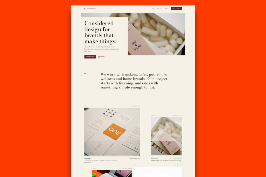
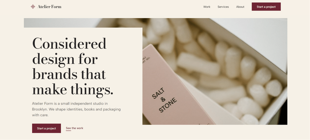
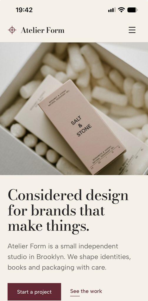
The homepage was particularly interesting. It featured a large serif headline reading:
“Considered design for brands that make things.”
The warm neutral background, burgundy buttons, and editorial typography were close to the direction I had imagined.
The page also included a featured project area, a short introduction to the studio, and a services overview.
Of course, generating a website doesn’t mean every detail will automatically match your expectations. Reviewing the result is an important part of the process.
I treated the first version as a starting point rather than assuming it was the final design.
3. Refining the Website
This is where the conversational aspect became important.
Rather than rebuilding the website from scratch, I could work with the generated result and refine the direction through chat.
For a portfolio website, the visual details matter. Typography, spacing, imagery, and the order of the sections all contribute to how professional the finished website feels.
I wanted the portfolio to have a clear structure, with enough breathing room between projects and a consistent visual identity throughout.
The result included several sections that worked together: the homepage, a dedicated Work page, and a Services page.
4. Exploring the Portfolio Page
The Work page was one of the sections I particularly wanted to get right.
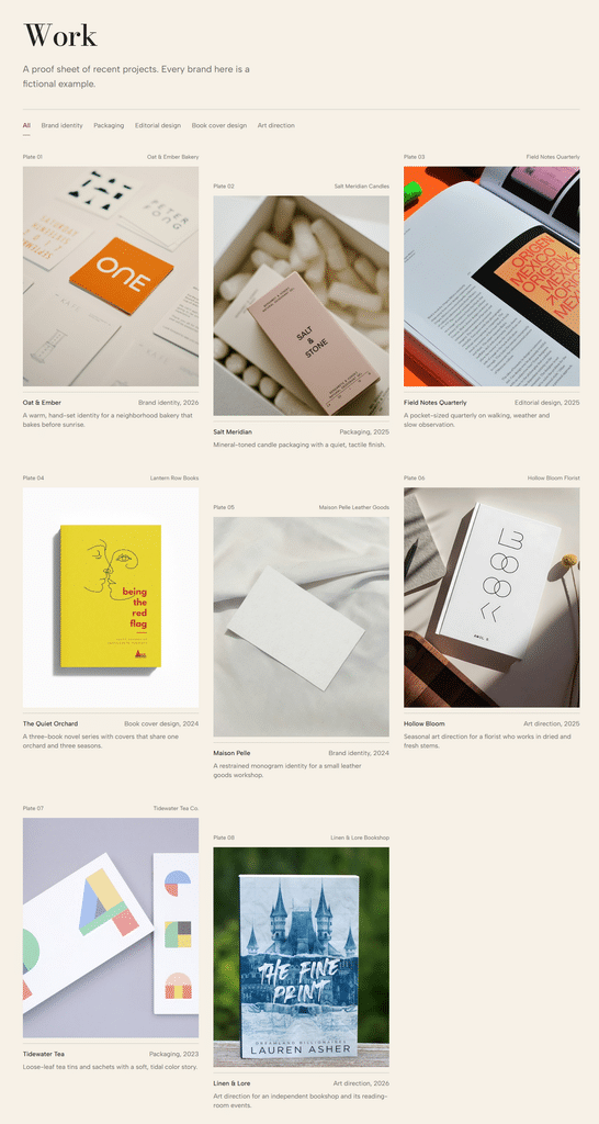
I wanted a portfolio that could display different types of creative projects without making everything look identical.
The generated page included a collection of fictional projects across different categories, including branding, packaging, editorial design, book covers, and art direction.
The layout used a staggered portfolio grid, with project images, titles, categories, and short descriptions.
I liked that the page gave each project its own space while keeping the overall layout consistent.
One important note: Atelier Form and its portfolio projects are fictional examples created for this experiment. They aren’t actual client commissions or completed commercial projects.
5. Looking at the Services Page
A portfolio is only one part of a creative studio website. Visitors also need to understand what the business offers.
The Services page presented five main areas:
- Brand identity
- Book cover design
- Editorial design
- Packaging
- Art direction
Each service had its own heading, description, and supporting image.
I liked the alternating layout because it made the page easier to browse. Instead of presenting five identical cards, the sections used a more editorial arrangement.
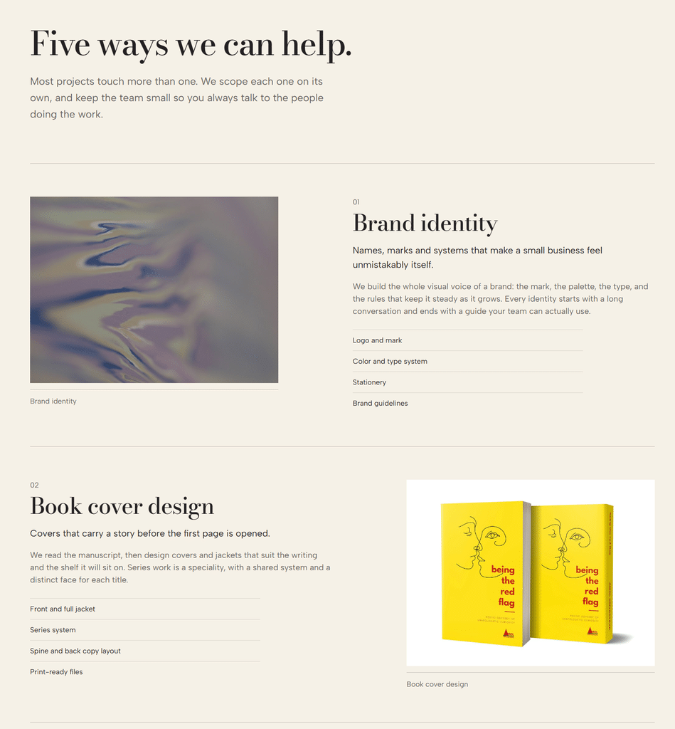
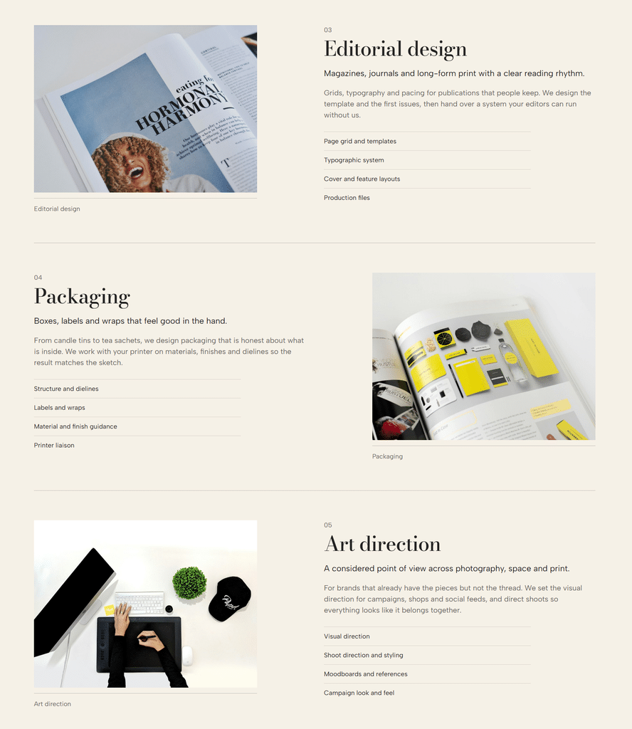
The five service categories are displayed in an alternating image-and-text layout.
6. Checking the Mobile Experience
A website can look great on a desktop screen and still feel awkward on a phone.
That’s why I also checked the mobile preview.
The navigation changed to a compact menu, the imagery adapted to the smaller screen, and the homepage content was rearranged into a vertical layout.
The headline remained prominent, and the introductory text and buttons were easy to identify.
It’s worth checking this view before considering any website finished, especially because many visitors will discover a website through their phones.
What I Liked About Bluehost AI Builder
After creating and reviewing the Atelier Form website, a few things stood out.
1. You can start with an idea rather than a technical plan.
I liked being able to describe the type of website I wanted instead of having to plan every page and section before starting.
2. The conversational editing approach is useful.
Being able to refine a generated website through chat makes the process feel more approachable. You can start with a general direction and become more specific as you see the results.
3. It gave me a complete website concept to work with.
I wasn’t just looking at a homepage. I could explore a portfolio, services, and mobile layout as part of the same project.
4. You can experiment before committing to a paid plan.
The free starting option makes it easier to explore the tool and see whether its approach suits your project.
A Few Things to Keep in Mind
There are also a few things I’d recommend considering before starting.
First, be specific about your website idea. A detailed description of your business, audience, pages, and visual direction gives you a clearer starting point.
Second, don’t expect the first generated version to be your final website. Review the layout, images, headings, buttons, and page content carefully. The generated result still needs your attention.
Third, keep an eye on your available credits. During my experiment, I noticed that the builder had four credits remaining after my initial creation and refinements. That made me more deliberate about the changes I wanted to request.
I’d recommend thinking through your main requirements before using credits on smaller adjustments.
Finally, remember the distinction between the free and paid options. The free plan publishes on a Bluehost subdomain, while connecting your own domain requires a paid plan. Paid plans start at $20/mo.
Is Bluehost AI Builder Worth Trying?
For someone who has an idea for a website but isn’t sure where to begin, I think Bluehost AI Builder is worth exploring.
My Atelier Form experiment showed me how a simple description could become a multi-section website concept with a homepage, portfolio, services, and mobile layout.
I particularly liked having the opportunity to review the generated design and refine it rather than starting with a completely blank page.
That said, the tool doesn’t remove the need for good decisions. You still need to know what your website should communicate, review the generated content, choose suitable images, and check that everything works as expected.
And if you’re building a website for an actual business, I’d recommend checking every detail before sharing it with customers.
My biggest takeaway? You don’t necessarily need to know how to build a website before you start exploring what yours could look like. Having a clear idea and being willing to refine the result can take you a long way.
If you’ve been thinking about creating a portfolio, a website for a small business, or a personal project, you can try Bluehost AI Builder for $0 to start, no credit card.
Paid partnership with Bluehost.
#sponsoredbybluehost #WebsiteDesign